Are Brown Boxes More Eco-friendly Than White Boxes?
That is most definitely a FAQ from our green minded customers and the answer is definitely yes, probably, in most cases. If that answer seems vague or non-committal, it is by design. The fact is there are many different ways to look at any packaging product’s greenness, and even more ways we can impact the natural sustainable features of packaging by what we do to it. Allow me to explain.
Green Packaging has always been a matter of perspective
Some people look at packaging strictly from a source perspective. What percentage of it is made of recycled content and what is that source. Post-consumer waste is rated much higher (greener) than post production waste, and that is better than virgin material.
Others are more concerned about packaging in terms of how easily it can be reused or if necessary, how it can be disposed of and/or recycled. As most people know, paper based packaging is typically much easier to recycle compared to plastic based packaging but it varies depending on a number of factors including type, and how it is printed or laminated.
Enhancing the Customer Experience
Making the box look sharp does not always mean making it more expensive or complicated. We apply the KISS principle as much as possible because we know that over designing a shipping box adds cost and in most cases makes it less eco-friendly. Adding costly finishes to any box almost always has a negative impact on how it can be recycled and re-pulped so we prefer to increase the proverbial “WOW factor” by using screens, well printed colors, and last but not least – good substrates. No one can create a great looking print on cheap or substandard board, but it does not have to be expensive; just consistent.
Why we usually suggest brown board for a box exterior
MOST board with a white side in or out, is NOT 100% recycled content. White is typically virgin paper, that does not make it bad, in fact it makes for a great printing surface, but it is definitely not green if the goal is to use as much recycled content as possible.
In addition to the obvious green benefit, brown board is typically 5 to 6% less expensive compared to white board. Darker colors, such as dark blue, brown, and black print beautifully over natural Kraft Board, as do lighter colors like white and most pastels. However, the main reason we usually suggest brown board has nothing to do with relative greenness or material cost.
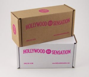
Simply put – brown boxes arrive looking better. Whether you ship UPS, FedEx or USPS, every box you ship is handled countless times and each time it ends up a little dirtier and beat up. This rough handling is much less obvious on brown board than it is on white board.
 However, the box interior usually arrives in perfect condition!
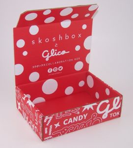
This is why we have become a leading designer of e-commerce boxes with interior prints. People can’t wait to open a box that just arrived, and we make sure they are greeted with a great looking box that creates the enhanced experience which is the goal of most shippers. That interior inside lid of a die cut mailer is a great printing surface for anything from a brief thank you to product use or assembly instructions, and can be inexpensively printed where they are not going to be missed or lost.
We believe this is such a great marketing tool that we have made it easy for companies to add or change an interior print, long after the box is first launched or printed. (see first related post below) It is never too late to make a great and memorable impression.
 White exteriors for flood coat designs
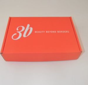
If a graphic design is going to require edge to edge (flood coat) printing, we will usually recommend that printing is done on a white surface rather than brown. Natural (brown) Kraft varies in color so anything printed over it may also reflect that same shade variance. So the easy way to achieve beautiful solid color is to print it over white board.
That also makes reverse printing much easier, creating white copy that really pops. If you check out some of the boxes in our gallery, they look like they are printed white ink over a solid color but the reality is that they are a solid color ink printed over white board. The end result creates a much sharper two color look using only one color ink and one print plate.
If all this sounds complicated, it is, but not for people who do this day in and day out. We know how to create the best looking package at the lowest possible cost and will help you accomplish whatever your goals might be whether they are about color, cost, sustainability or even weight reduction for minimizing shipping costs.
Contact us at Salazar Packaging or call us at 630-551-1700 to discuss your specific needs.
Related posts:
https://www.salazarpackaging.com/adding-inside-print-to-an-existing-subscription-or-e-commerce-box/
https://www.salazarpackaging.com/drives-e-commerce-subscription-box-redesign-rebranding/
https://www.salazarpackaging.com/balancing-protection-presentation-e-commerce-subscription-boxes/

