As consumers we have all done it, we have received a shipper box and then rotated it several times in search of the elusive flap that will help us determine the best way to open it. Or you find the flap and discover it is covered with layers of sealing tape. After several decades designing and making shipper boxes, I would be the first to admit that we do not always make it easy for the consumer. This is almost comical, considering one of the favorite current buzz terms in DTC packaging, is “enhancing the customer unboxing experience”.
What is the e-commerce unboxing experience?
This is one of those terms that means different things to different people. In most cases, it is all about how the box looks and how the customer feels when they first open it. Is the product being presented well, with everything in position and undamaged? For most customers and clients, it is all about the esthetics.
For others such as Amazon and their “Frustration Free” packaging for example, it is about utilizing a packaging design that allows the user-friendly removal of the product being shipped. Does it require a knife, prybar and a pair of pliers? Or is opening the shipping container, quick and effortless? Note, a design can be easy to open, without sacrificing security or inadvertently encouraging theft.
How to improve the unboxing of your package.
The quickest, and most inexpensive way is to print unboxing guides or directions. Most of our clients utilize branded packaging so adding a helpful arrow or a word or two of copy is probably cost free.
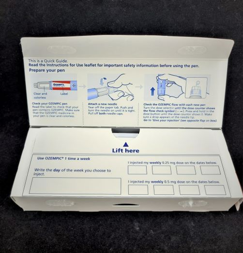
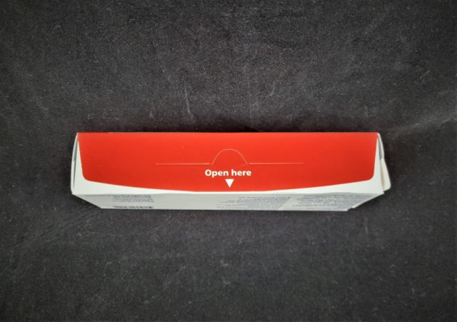
The box shown in the photos included in this post is for medication. It is difficult to miss the nice “open here” and arrow, white reverse printed on the bright red front flap. When that is open, a less obvious “lift here” with another arrow, directs the customer to the next step. I will confess that I am more of a “rip it open” kind of guy but this helpful info was so well placed in the graphic design that I did not have to guess how to get to the product.

Challenging graphic designers to help!
I admit in some cases, it is more difficult to incorporate opening instructions, or accommodating easy open and/or close options (more on that below) but it can be done, without ruining the graphic designer’s vision for the package. However, on most e-commerce boxes, there is plenty of open print space and we can certainly design the box to accommodate both esthetics and trouble-free unboxing.
Available options to facilitate a DTC box closure and opening.
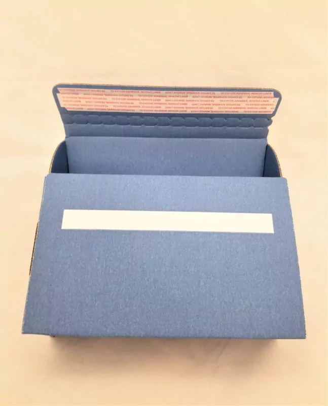
 Just a few weeks ago I wrote a blog post about “peel and seal” strips. Most people are familiar with adhesive strips and easy open perforations because they have seen them for years on UPS, FedEx and USPS shipper boxes and envelopes. The perforated tear strips are almost a must if you utilize an adhesive peel and seal strip, because otherwise, the package becomes almost impossible to open. What most people don’t know is that you can incorporate a perforated, zipper type tear strip into your package design, even if you don’t use the adhesive strip. If this is at all confusing, we understand.
The difficult job of writing posts for this blog is that there are so many product and application variables that it is virtually impossible to cover them all in any 500 to 700 word post. That is why I almost always end each post the same way:
If you’re unclear on something, or if you are wondering if a solution we offer will work for you, please do call us at 630-551-1700 to contact us via this post. Our people are experienced and trained to tell you whether or not a design option we offer can save you money in numerous ways, and help you deliver a more attractive box to your customers.
Related posts:
https://www.salazarpackaging.com/e-commerce-packaging-for-large-and-small-start-up-companies/
https://www.salazarpackaging.com/your-new-2023-dtc-packaging-is-waiting/
https://www.salazarpackaging.com/packaging-triage-and-how-we-fix-what-hurts/


