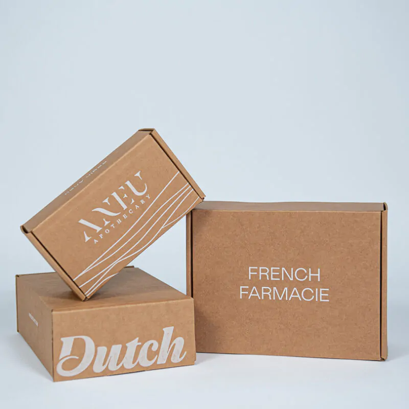
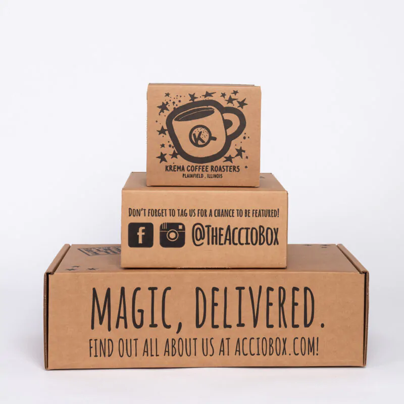
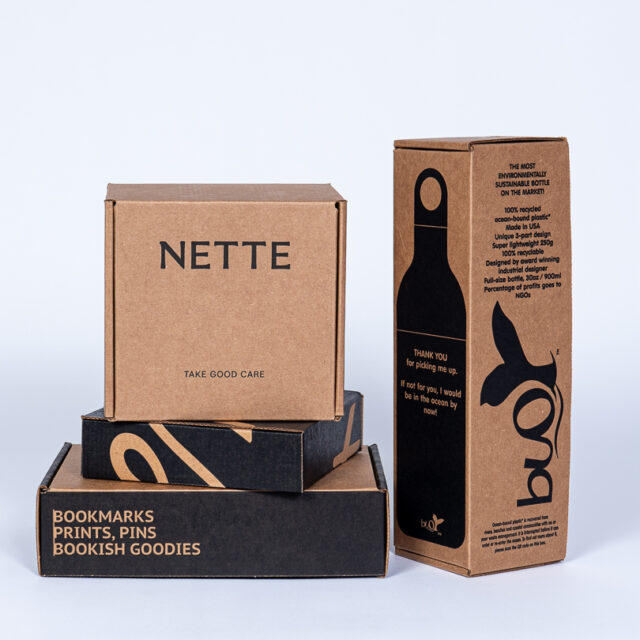
If you are investing in kraft-color, custom printed corrugated shipping boxes, you want to get the best return possible. Printing can be a combination of text and images (logos, etc.), but this post concentrates exclusively on text – an aspect of printed corrugated boxes that doesn’t always get the attention it deserves, as we will soon see.
Why Add Text to Shipping Boxes?
Before we start, let’s touch on the reasons companies print text on their boxes. Here are some of the most common, useful, and effective.
- Product identification
- Branding
- Marketing or sales messaging
- Safety messaging
- Handling and storage instructions
- Opening and/or return instructions
If you are using plain shipping boxes but see value in conveying any of these important messages, our custom product packaging team can help you put together an affordable design that gets the desired results.
Among the important things we will investigate thoroughly with you is the color, size, style, and positioning of your printed text. Let’s take a closer look these four important variables.
1. Text Color
Obviously, if you add text to your shipping box, people should be able to read it with minimal effort. Unfortunately, a brown corrugated background has some limitations in terms of contrast, so color choice for text must be made carefully. Black text provides the sharpest contrast; dark blues, greens, and purples are also easy on the eye. Red works if you are not after a really bright effect; lighter colors such as yellows and oranges will not provide much “pop.”
White text provides excellent readability but is technically difficult for many manufacturers to produce with high contrast. We are proud to say we have developed our own ink formulation, “Salazar White,” that pops like no other. Our white text is a superb option because not only is it highly readable, but it also stands out from the crowd and grabs attention.
In some cases, the need for branding consistency necessitates a color selection that will not produce acceptable contrast on the shipping box. In those cases, we often recommend labeling or a white, rather than kraft, shipping box.

2. Text Size
How big should the text be on the box? This is an excellent question, and sometimes, companies don’t think about it carefully enough. In order to judge text size, you need to understand how your boxes are being used.
For instance, for a subscription box, recipients will be looking at it very close-up. That being the case, the print size need not be enormous to be effective. However, even here, you must think about your audience. If your subscription market is, say, senior citizens, text that is overly small could become an annoyance.
On the other hand, if you are, for example, shipping industrial components that will sit in the box on your customer’s storage rack, text may have to be large enough to allow for product identification from a considerable horizontal and/or vertical distance.
Thus, it is important for the person determining specifications for text size to be familiar with the application, to understand exactly how the box is being used.
3. Text Style
Since everyone these days spends (at least) a fair amount of time on a mobile phone, most of us understand the importance of readable fonts. Font choices are endless; when you review options be sure your font selection is maximally readable from whatever distance(s) it will be read from. If you are unsure about the readability of various fonts, we are happy to offer suggestions.
Also, be sure to apply some good old common sense to your font selection. If you are selling medical supplies, you don’t want a font that looks cartoonish; if you are selling party supplies, you don’t want a font that looks like it should be etched on a gravestone. These examples demonstrate one reason why it’s wise to loop in sales and marketing personnel to custom shipping box design.

4. Text Positioning
Should your text be on one box panel? Two? Four? The top? These questions are sometimes harder to answer than meets the eye, so to speak.
As always, one of the best ways to arrive at the right answer is to understand your application, how people experience the box in the field. Let’s go back to the example of product identification for a box being stored on your customer’s storage rack. Does your customer place that box on the rack with the same panel facing outward 100% of the time, or might the box go into the rack any which way? In the first case, a one-panel print may be all you need, but in the second case, you’ll need a four-panel print, possibly even printed upside-up and upside-down on each panel.
Perhaps surprisingly, companies sometimes neglect to consider how they are closing the box and prepping it for shipment when determining the position of the text — and end up with a box where the text is partially hidden by colored box sealing tape or a shipping label. As we often say, packaging is a business that requires attention to detail.
To repeat what we said earlier, this post concentrates on printed text. When box printing involves images — logos, illustrations, shapes, patterns, etc. — even more care is required. But don’t worry, because …
Our Custom Packaging Design Specialists Will Help You Sort It Out
We are frequently asked to help work through all the issues discussed above. If you need eyes in the field observing how your shipping boxes are used, technical recommendations for text color and positioning, someone to aggregate input from your sales, marketing, and purchasing teams and turn it into a proposal — we are as close as an email or phone call.
Let’s get started today!
Related posts:
https://www.salazarpackaging.com/five-tips-for-new-e-commerce-box-buyers/
https://www.salazarpackaging.com/printing-colors-on-brown-corrugated-board/
https://www.salazarpackaging.com/dtc-e-commerce-boxes-the-white-board-or-kraft-board-question/


